
Here is a recap of market performance for the month of April and year-to-date:
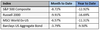
April was another volatile month in financial markets. All asset classes declined, with bonds down the least. International stocks outperformed other stocks, but not by much. So far this year, both bonds and stocks have decreased, and including April’s declines, stocks have gone down more than bonds.
Recession – The Next Obstacle?
If it seems like there are always problems in the world, well, that’s because there are. Many of them negatively-affect financial markets. In just the past two years, we’ve had a pandemic, higher inflation, and war. And over the past few weeks speculation has increased around another concern for investors: economic recession.
Most of the time, both the US and global economies grow. This simply means that we produce more goods and services than we did in the prior quarter or year. Companies make things, consumers buy them, and each year we typically become a little bit more prosperous than the year before. Gross Domestic Product (GDP) measures the size of the economy over time. Here is a graph of GDP, not including the effects of inflation:
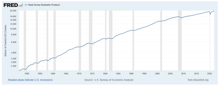
Using the common standard of 2012 dollars, in 1950, our economy produced around $2 trillion worth of goods and services. Today that number is almost $20 trillion. Since this doesn’t include inflation, it is an apples to apples comparison. It means our economy is 10x bigger today than it was 70 years ago. For the most part, the line is fairly straight, but there are times when GDP shrinks. These periods are called recessions, and are represented by the gray bars on the chart. We’ve had 12 of them, or roughly one every 6 years.
How do we know when the next recession is coming? We don’t. But many investors pay attention to the bond market for clues about economic weakness. One of the main indicators of economic health is the treasury bond yield curve, which shows the interest rates on US government bonds of various maturities:
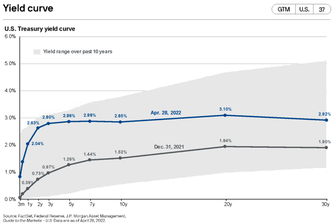
On the chart, the vertical axis shows the interest rate and the horizontal axis shows the maturity of the bond. The shape of the blue line, which shows the current yield curve, is quite flat. This means that longer term bonds are paying about the same interest rate as shorter-term bonds. This isn’t normal – because longer term bonds have more risk, they ought to pay higher rates. When that isn’t the case, it’s a signal that the bond market is concerned about future economic weakness. Or in other words, there is a higher probability of a recession.
Another way to look at the shape of the yield curve is by taking the 10-year bond rate and subtracting the 2-year bond rate. That chart looks like this:
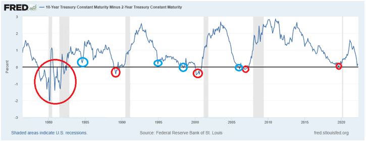
Typically, a 10-year treasury bond yields between 0-3% more than a 2-year treasury does. Occasionally, the 2-year bond yields more than the 10-year bond. This is called an inversion of the yield curve, and it typically coincides with a coming recession (shown by the gray bars). Yield curve inversions that were closely followed by recessions are circled in red. The blue circles show periods where the yield curve flattened considerably or inverted slightly, but a recession did not immediately follow. As you can see, recession worries have increased because the yield curve is currently very flat, but a flat yield curve doesn’t always mean a recession is imminent.
Conclusion – Let’s Talk
In the long run, economic growth has been incredibly strong and remarkably consistent. Occasionally, recessions of various lengths and severities happen, and while they can be unpleasant, they are a normal part of the economic cycle. We have designed your portfolio with a diversified mix of investments that can weather and endure volatile market environments to help you achieve your financial goals.
If you would like to talk more about the recent market volatility or the current economic climate, let’s talk.